How Do I Create Scatter Plots in Excel Using SigmaXL?
SigmaXL makes it easy to create scatter plots in Excel for correlation analysis and regression modeling.
Scatter plots are a core tool in Six Sigma and Lean analysis, helping teams visualize relationships between continuous variables in the Analyze phase of DMAIC.
Open Customer Data.xlsx. Click Sheet 1
Tab.
Click SigmaXL > Graphical Tools > Scatter Plots; if necessary,
click Use Entire Data Table, click Next.
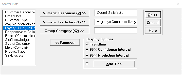
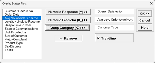
Select Overall Satisfaction, click Numeric
Response (Y) >>; select Avg Days Order Time to Delivery,
click Numeric Predictor (X1) >>.
Check Trendline, 95% Confidence Interval and
95% Prediction Interval as shown:
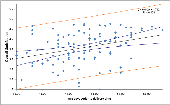
Click OK.
The resulting Scatter Plot is shown with equation, trendline, 95% confidence interval
(blue lines for a given X value this is the 95% confidence interval for predicted mean
Overall Satisfaction) and 95% prediction interval (red lines for a given X value this
is the 95% confidence interval for predicted individual values of Overall Satisfaction).
The equation is based on linear regression, using the method of least squares. R-squared
* 100 is the percent variation of Y explained by X (here 10.3%).
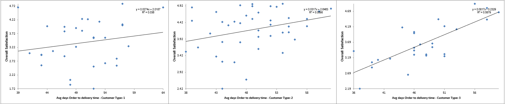
Now we want to redo the Scatter Plot and stratify by Customer Type.
Press
F3 or click Recall SigmaXL Dialog to recall last
dialog. (Or, Click
Sheet 1 Tab; Click SigmaXL > Graphical Tools > Scatter
Plots; click
Next.)
Select Overall Satisfaction , click
Numeric Response (Y) >>; select Average Days Order Time to
Delivery, click
Numeric Predictor (X1) >>; select Customer Type, click
Group Category (X2) >>, Uncheck 95% Confidence
Interval and
95% Prediction Interval. Click OK:
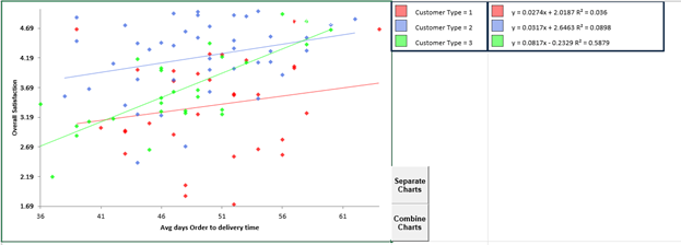
Clearly, according to the analysis, Customer Type 3 is happier if orders take longer!
But, does this make sense? Of course not! Customer Sat scores should not increase with
Order to Delivery time. What is happening here? This is a coincidental situation.
Something else is driving customer satisfaction. Later, we will look at the Scatter Plot
Matrix to help us investigate other factors influencing Customer Satisfaction.
Tip: Be careful when interpreting scatter plots (and other statistical
tools): Y versus X correlation or statistical significance does not always mean that we
have a causal relationship.
Umbrella sales are highly correlated to traffic accidents, but we cannot reduce the rate
of traffic accidents by purchasing fewer umbrellas! The best way to validate a
relationship is to perform a Design of Experiments (see Improve Phase).
Overlay Scatter Plots with Trendline
We will redo the previous example but now use Overlay Scatter Plots.
Open Customer Data.xlsx.
Click Sheet 1 Tab.
Click SigmaXL > Graphical Tools > Overlay Scatter Plots; if necessary, check Use Entire Data Table, click Next.
Select Overall Satisfaction, click
Numeric Response (Y) >>; select
Avg Days Order Time to Delivery, click Numeric Predictor (X1) >>; select Customer Type, click Group Category (X2) >>, check Trendline as shown:
Note: A maximum of 5 Numeric Data Variables or 5 Group Category levels are permitted.
We recommend using this to compare 2 or at most 3 variables/levels.
Click OK. Overlay Scatter Plots of Overall Satisfaction vs Average Days Order Time to Delivery, by Customer Type are produced:
The Overlay Scatter Plots can be separated and combined. Colors and Transparency levels can be adjusted using Excel's Format Chart Area tool.
Scatter Plots with Quadratic Trendline
SigmaXL does not include nonlinear or polynomial curve fitting, so this
example shows how a trendline in a
Scatter Plot with Trendline may be modified in Excel to show a quadratic
relationship.
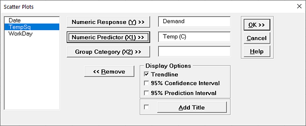
Open Daily Electricity Demand with Predictors
ElecDaily.xlsx (Sheet 1 tab). This is daily electricity
demand (GW) for the state of Victoria, Australia, every day during 2014. Temp (C) is the
maximum daily temperature in degrees Celsius for the city of Melbourne. (The additional
columns are not used here: TempSq is Temperature squared, WorkDay takes on the value 1
on work days and 0 otherwise.
This data is analyzed later using Time Series Forecasting, see ARIMA
Forecast with Predictors).
Click SigmaXL > Graphical Tools > Scatterplots.
Ensure that the entire data table is selected. If not, check Use Entire Data
Table. Click Next.
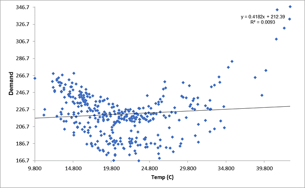
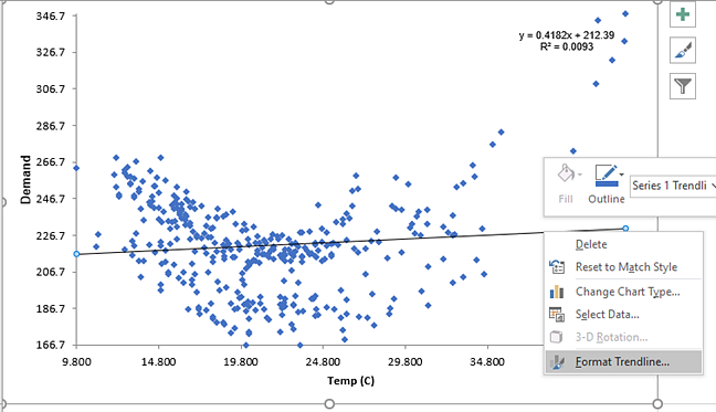
Click OK. A Scatter Plot of Electricity Demand versus
Temperature is produced.
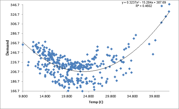
This shows a quadratic relationship: high temperatures in the summer cause
electricity demand for air conditioning, low temperatures in the winter cause demand for
heating.
We will modify the trendline in Excel to a quadratic fit.
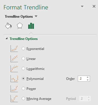
Click on the Trendline, right click and select Format Trendline as shown:
The Format Trendline options are given. Select Polynomial
with Order 2 as shown.
The Trendline is now a quadratic function as shown:
P-Values for coefficients and model residuals are not available.
For a quadratic model like this, these may be obtained using Multiple Linear Regression
with Temp and TempSq as model predictors.