Rare Events G Chart
- Home /
- Rare Events G Chart
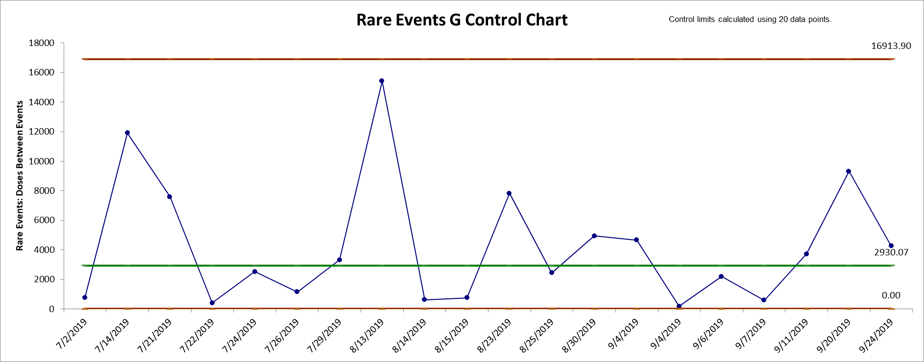

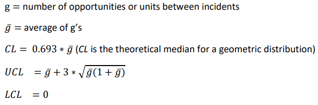
The G chart (or Geometric chart) is an alternative to a standard attribute chart
when the adverse
event of interest is rare and discrete opportunities between events are counted
(e.g., number of
units or days between).
The calculation of control limits is an approximation based on the
geometric distribution. An "out-of-control" signal above the UCL is
desirable, indicating a significant increase in units/opportunities
or days between adverse rare events. See Provost and Murray, 2011. The Provost and
Murray book is popular in health care, so SigmaXL uses the control limit
calculations as given in the book:
For more accurate probability-based limits, see the Rare Events Prob
G Control Chart.
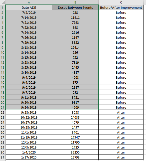
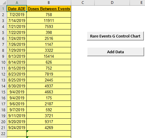
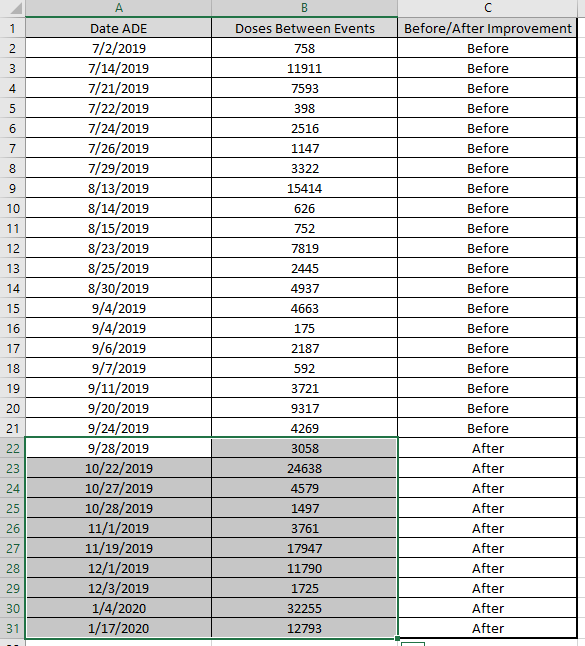
1. This Rare Events G Control Chart template should be used with
days or units/opportunities between (typically adverse) rare events.
2. You can replace the Date/Time and Days
Between column headings with any headings that you wish.
3. Enter date in the Date column. Days between are
automatically calculated and entered into Days Between
column. Cell B2 is not used in this case.
4. Alternatively, you may manually enter data in Days/Units
Between. Note, this will overwrite the cell formula.
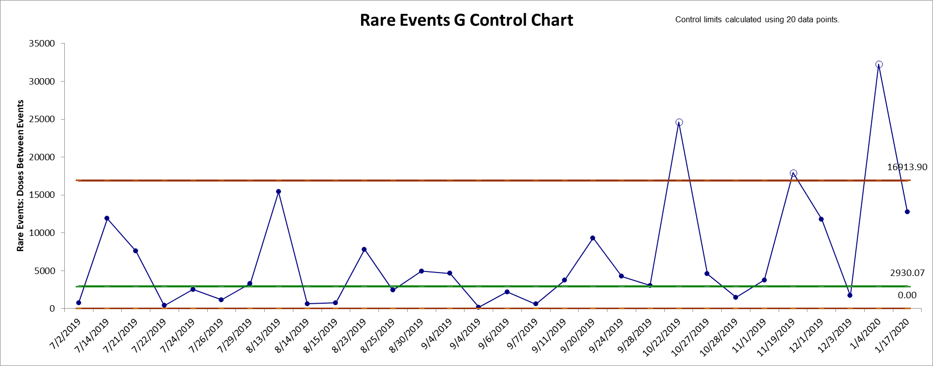
5. Click the Rare Events G Control Chart button to
create a control chart. This will overwrite any existing control
chart.
6. After the control chart has been created and additional new
Date or Days/Units Between data
entered, click the Add Data button to add the data
to the existing chart.
7. An "out-of-control" signal above the UCL is desirable, indicating
a significant increase in days or units/opportunities between
adverse rare events.
8. The calculation of control limits is based on the geometric
distribution. The center line is the theoretical median for a
geometric distribution = 0.693 * mean.
9. Reference: Provost L, Murray S., The Health Care Data Guide:
Learning from Data for Improvement. San Francisco: Jossey-Bass,
2011, pp. 228-229.
The Rare Events Prob
(Probability-Based) G chart (or Geometric chart) is an alternative
to a standard attribute chart when the adverse event of interest is
rare and discrete opportunities between events are counted (e.g.,
number of units or days between). The use of probability-based
control limits is recommended in order to properly control the Type
I (false alarm) error rate.
The calculation of control limits is based on the
geometric
distribution. Event probability and alpha are used to compute the
non-symmetrical limits. An "out-of-control" signal above the UCL is
desirable, indicating a significant increase in units/opportunities
or days between adverse rare events. See Benneyan, 2001.
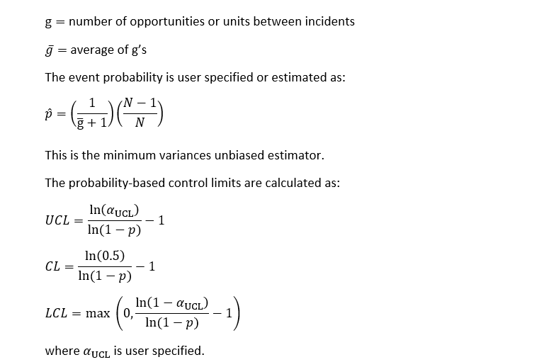
SigmaXL adjusts the Benneyan CL and LCL by subtracting 1 as done in
the UCL and does not round the limit values. Opportunities between
events are counted as 0, 1, 2, 3, (a=0 in Benneyan Table 3).
1. This Rare Events Prob (Probability-Based) G Control Chart
template should be used with days or units/opportunities between
(typically adverse) rare events.
2. You can replace the Date/Time and Days
Between column headings with any headings that you wish.
3. Enter date in the Date column. Days between are
automatically calculated and entered into Days Between
column. Cell B2 is not used in this case.
4. Alternatively, you may manually enter data in Days/Units
Between. Note, this will overwrite the cell formulas.
5. Enter Alpha UCL, typically 0.00135,
corresponding to the one-sided probability for UCL in a classical
Shewhart control chart with 3 sigma limits. This will also be
applied to the LCL if greater than 0.
6. The calculation of control limits is based on the geometric
distribution. Event probability and alpha are used to compute the
non-symmetrical limits. Calculated event probability is noted on the
control chart.
7. Optionally enter the historical Event Probability.
8. Click the Rare Events Prob G Chart button to
create a control chart. This will overwrite any existing control
chart.
9. After the control chart has been created and additional new
Date or Days/Units Between data
entered, click the Add Data button to add the data
to the existing chart. Control limits will be calculated using the
original chart event probability or specified event probability.
10. Add Data should only be used if there are at least 20
observations in the original chart or known historical Event
Probability has been specified.
11. An "out-of-control" signal above the UCL is desirable,
indicating a significant increase in days or units/opportunities
between adverse rare events.
12. Reference: Benneyan, J.C. (2001), "Performance of Number-Between
g-Type Statistical Control Charts for Monitoring Adverse Events",
Health Care Management Science, 4, pp. 319336, Table 3.