How Do I Create P' Charts (Laney) in Excel Using SigmaXL?
P' and U' (Laney) Control Charts are attribute control charts that should be used when the
subgroup/sample size is very large (i.e. > 5,000) and assumptions are not met. Typically you
will see that the control limits do not look right, being very tight with many data points
appearing to be out-of-control. This problem is also referred to as overdispersion. This
occurs when the assumption of a Binomial distribution for defectives or Poisson distribution
for defects is not valid. Individuals charts are often recommended in these cases, but
Laneys P and U charts are a preferred alternative.
P'-Charts
Open Laney Quality Digest Defectives.xlsx. This data is used with
permission from David Laney.
We will begin with the creation of a regular P-Chart for this data.
Select
SigmaXL > Control Charts > Attribute Charts > P. Ensure that
the entire data table is selected. If not, check
Use Entire Data Table. Click Next.
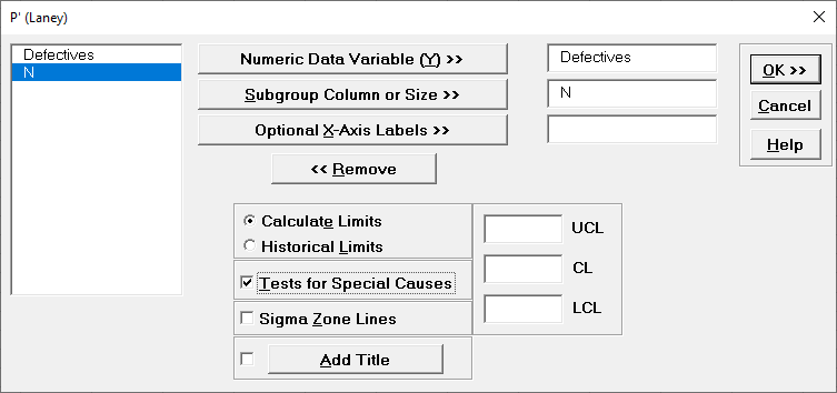
Select Defectives as the
Numeric Data Variable (Y) >>, N as the
Subgroup Column
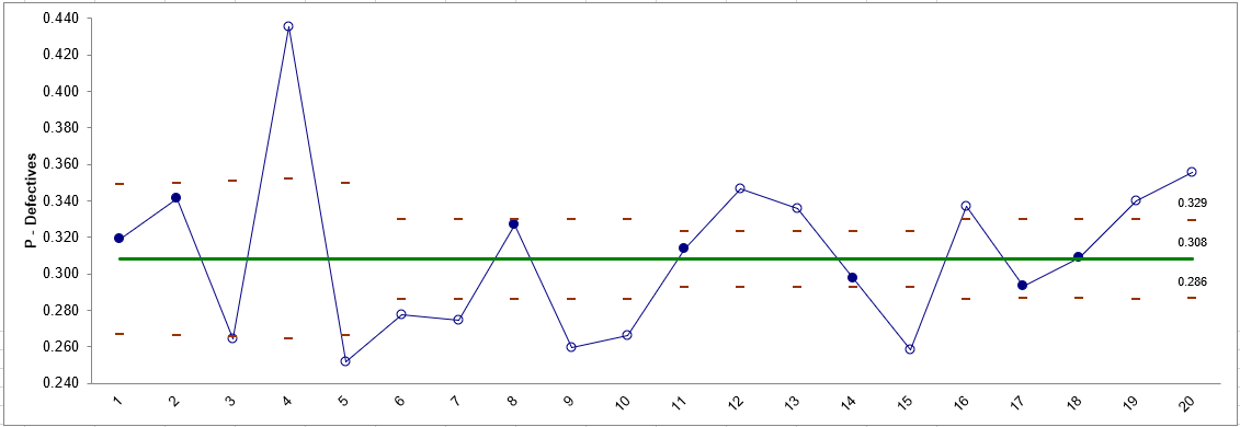
or Size >>. Click OK. The resulting P-Chart is
shown:
At first glance, this chart suggests that the process is out
of control. The problem here is actually due to the Binomial assumption not being
valid (also known as overdispersion). This
problem becomes evident when the sample sizes are large.
Select Sheet
Defectives (or press F4). Click
SigmaXL > Control Charts > Attribute Charts > P (Laney).
Click
Next.
Select Defectives, click
Numeric Data Variable (Y) >>; select N, click
Subgroup Column or Size >>. (If we had a fixed subgroup size, the
numerical value of the subgroup size could be entered instead of Column N.) Check
Test for Special Causes.
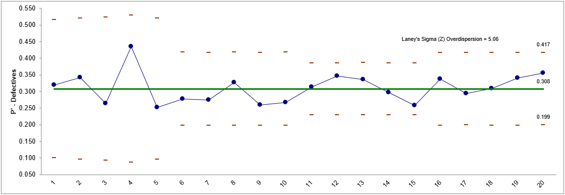
Click OK. The resulting P'-Chart is shown:
Now we see that the process is actually in-control. Laneys Sigma
(Z) is a measure of the overdispersion. See referenced articles for further
details.