Interval Plots
Interval Plots show the mean and confidence interval, similar to the Multi-Vari chart, but do
not display the individual data points. The confidence intervals are computed as done in
Descriptive Statistics with the standard deviation calculated separately for each group, so
they are labelled "Unpooled". (Interval Plots with confidence intervals based on pooled
standard deviation are given in One Way ANOVA).
- Open Customer Data.xlsx. Click Sheet 1 Tab (or press
F4 to activate last worksheet).
- Click SigmaXL > Graphical Tools > Interval Plots.
- Check Use Entire Data Table, click Next.
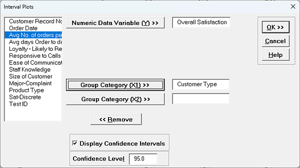
- Select Overall Satisfaction, click Numeric Data Variable (Y)
>>. Select Customer Type, click Group Category (X1)
>>; check Display Confidence Intervals; Confidence
Level default is 95%:
Tip: Uncheck
Display Confidence Intervals to produce a Main Effects Plot.
- Click
OK. The Interval Plot for Customer Satisfaction grouped by Customer
Type is shown:
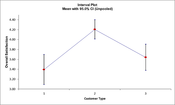
The tick marks show the 95% upper and lower
confidence limits. The
red dot shows the mean. As noted in the Multi-Vari chart, we can see that Customer Type
2 has a significantly higher level of mean satisfaction; the lower limit does not
overlap with the upper limit for Types 1 and 3. On the other
hand, we see overlap of the CI's when comparing types 1 and 3. Hypothesis testing will
be used to compare the mean satisfaction scores more precisely and determine statistical
significance for the results.
Multiple X Interval Plots
Multiple X Interval Plots are similar to Multiple X Boxplots and allow you to create interval
plots with one Y variable and multiple group category X's. A row of interval plots will be
created, one for each X variable. This is useful for easy comparison of the effect of each
category X. Confidence Intervals may be unchecked, in which case the plots are equivalent to
Main Effects plots for data means.
- Click Sheet 1 Tab of Customer Data.xlsx (or press
F4 to activate last worksheet).
- Click SigmaXL > Graphical Tools > Multiple X Interval
Plots.
- Ensure that entire data table is selected. If not, check Use Entire Data
Table. Click Next.
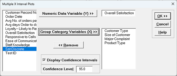
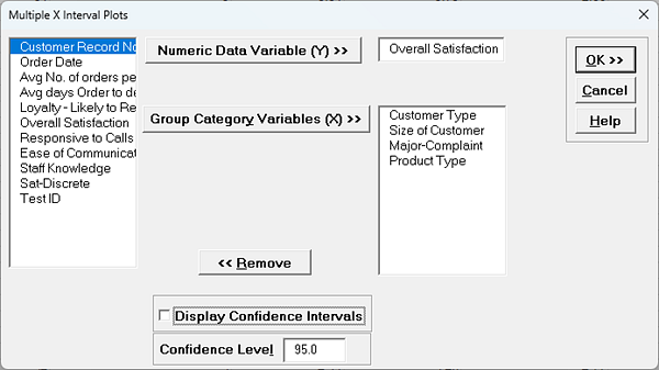
- Select Overall Satisfaction, click Numeric Data Variable (Y)
>>. Select Customer Type, Size of Customer, Major-Complaint and
Product Type. Click Group Category Variables (X) >>.
Check
Display Confidence Intervals with Confidence Level
95%:
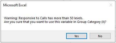
Tip: Be careful to not select a continuous variable for Group
Category Variables (X), as each unique value will be considered as a
category level. If SigmaXL detects a variable with more than 50
levels a warning is given. For example, if Responsive to Calls was
selected:
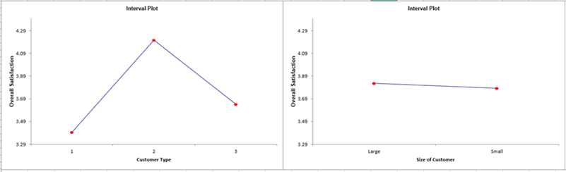
- Click OK. A row of Interval Plots showing Overall Satisfaction by
Customer Type, Size of Customer, Major-Complaint and Product Type are produced:
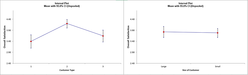
The only
factor with non-overlapping confidence intervals is Customer Type. Statistical
significance for these factors can be formally evaluated individually
using One-Way ANOVA or as a group in General Linear Model (GLM).
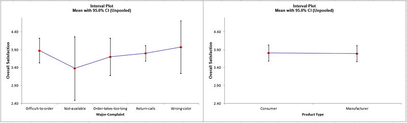
- Now we will create Interval Plots without confidence intervals. Click Recall
SigmaXL Dialog menu or press F3 to Recall Last Dialog.
Uncheck Display Confidence Intervals.
- Click OK. A row of Interval Plots showing Overall Satisfaction by
Customer Type, Size of Customer, Major-Complaint and Product Type are produced:
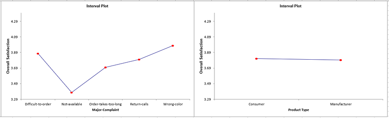
These are
also known as Main Effects Plots for data means, with steeper slopes noted for Customer
Type and Major Complaint.