Use the Heatmap graphical tool to display counts or summary statistics in Pivot table format
with results gradient color coded: minimum is dark blue to maximum dark red. This allows you
to easily 'slice and dice' your data, quickly look at different X factors and their
contribution to the total or summary statistics (typically the mean), aided by the color
coding. Up to Three Row Categories and Three Column Categories are permitted.
If an Optional Numeric Response is not specified, SigmaXL will use Counts as the statistic to
display. If a Numeric Response is specified the following statistics are available:
Mean
Sum
Median
Percentile
Standard Deviation
Minimum
Maximum
Range
Interquartile Range
Percent >= value 1 and <= value 2
Percent < value 1 or > value 2
Percent = specified value
Percent <> specified value
Percent <= specified value
Percent < specified value
Percent >= specified value
Percent > specified value
Count
This provides a much more versatile set of descriptive statistics than are available in
SigmaXL's EZ-Pivot or Excel's Pivot table.
Example: Customer Data Heatmap — No Numeric Response (Count Display)
We will use the Heatmap tool to analyze the Customer Data as done with EZ-Pivot Example of Three Xs, No Response Ys. Open Customer
Data.xlsx, click Sheet 1 (or press F4 to
activate last worksheet). Select SigmaXL > Graphical Tools >
Heatmap.
Ensure that the entire data table is selected. If not, check Use Entire Data
Table. Click Next.
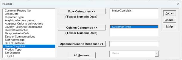
Select Major Complaint, click Row Categories >>. Select
Customer Type, click Column Categories >>. Note that if
Optional Numeric Response is not specified, the Heatmap Table Data is
based on counts.
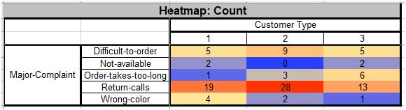
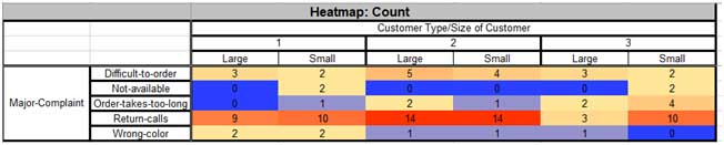
Click OK. The resulting Heatmap of Count for Major Complaint by
Customer Type is shown:
Dark red highlights the maximum count; dark blue highlights the minimum count.
Tip: Heatmap colors may be changed using Excels Conditional
Formatting: Select the data excluding Row and Column headers, click Home >
Conditional Formatting > Color Scales.
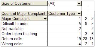
Note that this matches the Pivot Table given in the example:
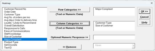
Now we will add Size of Customer to the Column Categories. Click Recall
SigmaXL Dialog menu or press F3 to Recall Last Dialog.
Select Size of Customer, click Column Categories >>.
Click OK. The resulting Heatmap of Count for Major
Complaint by Customer Type/Size of Customer is shown:
Example: Customer Data — Mean of Overall Satisfaction
We will now use the Heatmap tool to analyze the Customer Data as done with EZ-Pivot Example of Three Xs, No Response Ys. Select Sheet
1 of Customer Data.xlsx; click SigmaXL >
Graphical Tools > Heatmap; click Next (alternatively,
click Recall SigmaXL Dialog menu or press F3 to recall
last dialog).
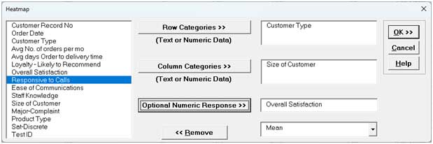
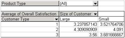
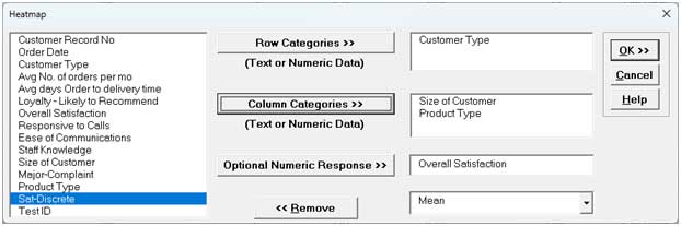
Select Customer Type, click Row Categories >>; select
Size of Customer, click Column Categories >>; select
Overall Satisfaction, click Optional Numeric Response>>.
Use the default statistic Mean as shown:
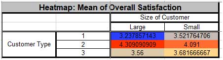
Click OK. The resulting Heatmap of Mean of Overall Satisfaction by
Customer Type and Size of Customer is shown:
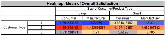
Dark red highlights the maximum mean; dark blue highlights the minimum mean.
Tip: Heatmap colors may be changed using Excels Conditional
Formatting: Select the data excluding Row and Column headers, click Home >
Conditional Formatting > Color Scales.
Note that this matches the Pivot Table given in the example:
Now we will add Product Type to the Column Categories. Click Recall
SigmaXL Dialog menu or press F3 to recall last
dialog.Select Product Type, click Column Categories >>.
Click OK. The resulting Heatmap of Mean of Overall
Satisfaction by Customer Type and Size of Customer/Product Type is shown:
Example: Customer Data — Other Statistics
We will now use the Heatmap tool to analyze other statistics for Overall Satisfaction by
Customer Type. Select Sheet 1 of Customer Data.xlsx;
click SigmaXL > Graphical Tools > Heatmap; click
Next (alternatively, click Recall SigmaXL Dialog menu
or press F3 to Recall Last Dialog).
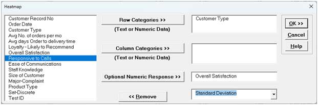
Select Customer Type, click Row Categories >>; select
Overall Satisfaction, click Optional Numeric Response>>.
Select the statistic Standard Deviation as shown:
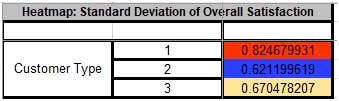
Click OK. The resulting Heatmap of Standard Deviation of Overall
Satisfaction by Customer Type is shown:
Dark red highlights the maximum standard deviation; dark blue highlights the minimum
standard deviation.
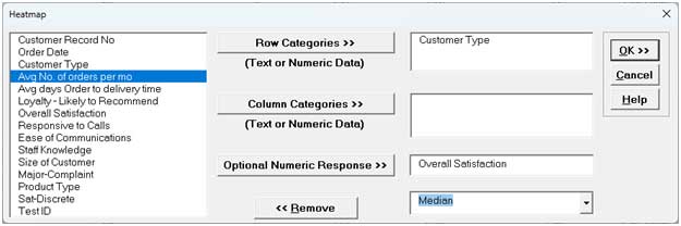
Now we will analyze the data using Medians. Click Recall SigmaXL Dialog
menu or press F3 to Recall Last Dialog. Select the statistic
Median as shown:
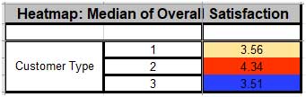
Click OK. The resulting Heatmap: Median of Overall Satisfaction by
Customer Type is shown:
Dark red highlights the maximum median; dark blue highlights the minimum median.
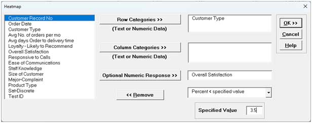
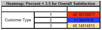
Next we will analyze Percent with Overall Satisfaction < 3.5 (i.e., percent
dissatisfied customers). Click Recall SigmaXL Dialog menu or press
F3 to Recall Last Dialog. Select the statistic Percent <
specified value; enter 3.5 for Specified Value as
shown:
Click OK. The resulting Heatmap of Percent < 3.5 for Overall
Satisfaction by Customer Type is shown:
Dark red highlights the maximum percent; dark blue highlights the minimum percent. Since
this is percent dissatisfied customers, lower is better.