One of the most powerful features in Excel is the Pivot table. SigmaXL's EZ-Pivot tool
simplifies the creation of Pivot tables and Pivot Charts using the familiar X and Y dialog box found in the previous Pareto tools.
Ensure that entire data table is selected. If not, check
Use Entire Data Table. Click Next.
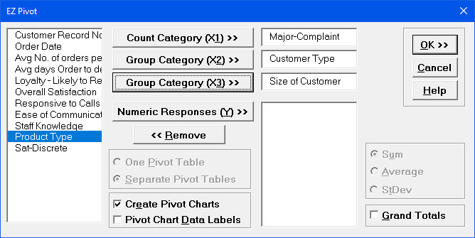
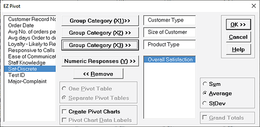
Select Major Complaint, click Count Category (X1) >>.
Note that if Y is not specified, the Pivot Table Data is based on a count of X1, hence
the name
Count Category.
Select Customer Type, click Group Category (X2) >>;
select
Size of Customer, click Group Category (X3) >> as
shown.
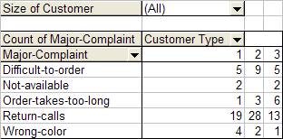
Click OK. Resulting Pivot Table of Major Complaint by Customer Type is
shown:
This Pivot table shows the counts for each Major Complaint (X1), broken out by Customer
Type (X2), for all Sizes of Customers (X3). (Grand Totals can be added to the Pivot
Table by using
Pivot Table Toolbar > Table Options. Check
Grand Totals for Columns, Grand Totals for Rows).
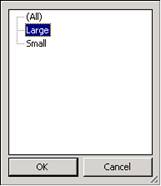
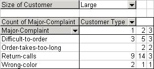
To display counts for a specific Customer Size, click the arrow adjacent to
Size of Customer (All). Select Large.
Click OK. Resulting Pivot Table is:
Note that the Major Complaint "Not-Available" is not shown. Pivot table only show rows
where there is at least a count of one.
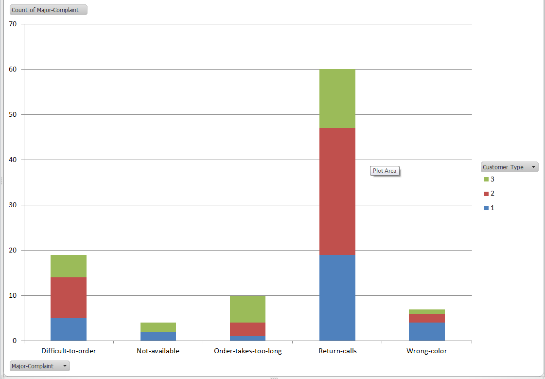
The Pivot Chart can be seen by clicking the
EZ Pivot Chart (1) tab; reset Size of Customer to All
as shown below:
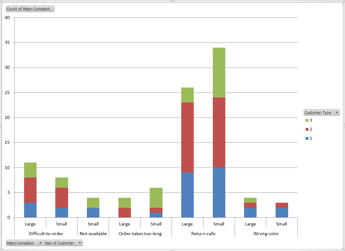
Drag the Size of Customer button adjacent to the left of the
Major Complaint button and Excel will automatically split the Pivot
Chart showing both Large and Small Customers.
Example of Three X's and One Y
Select Sheet 1 of
Customer Data.xlsx; click SigmaXL > Graphical Tools >
EZ-Pivot/Pivot Charts; click
Next (alternatively, click Recall SigmaXL Dialog menu
or press
F3 to Recall Last Dialog).
Select Customer Type, click
Group Category (X1) >>; select Size of Customer, click
Group Category (X2) >>; select Product Type, click
Group Category (X3); select Overall Satisfaction,
click Numeric Responses (Y) >>. Note that the Label for
X1 changed from Count Category to
Group Category. The Pivot Table data will now be based on Y data.
The Response default uses a Sum of Y. This however can be changed to Average or Standard
Deviation. Select
Average. Uncheck Create Pivot Charts (Since we are
looking at averages, the stacked bar Pivot Charts would not be very useful, unless they
are changed to
clustered column format using Chart > Chart
Type).
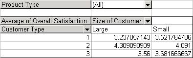
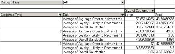
Click OK. The resulting Pivot Table is:
Note that the table now contains Averages of the Customer Satisfaction scores (Y). Again
Product Type (X3) can be varied to show Consumer, Manufacturer, or All. Double clicking
on
Average of Overall Satisfaction allows you to switch to Standard
Deviation (StdDev).
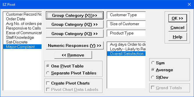
Example of Three Xs and Three Ys
Click Recall SigmaXL Dialog menu or press
F3 to Recall Last Dialog.
Select Customer Type, click Group Category (X1) >>;
select Size of Customer, click Group Category (X2) >>;
select Product Type,
click Group Category (X3) >>. Select Avg Days Order to
Delivery, Loyalty Likely to Respond, Overall Satisfaction,
click Numeric Responses
(Y) >>. Select Average and One
Pivot Table (default is separate Pivot Tables for each
Y). Uncheck Create Pivot Charts.