Cross Correlation (CCF) Plots
Cross Correlation is similar to autocorrelation, but the correlations are computed on two
related time series variables, typically a process input and output. A plot of the X data
vs. the Y data at lag 𝑘 may show a positive or negative trend. If the slope is positive,
the cross correlation is positive; if there is a negative slope, the cross correlation is
negative. This helps to identify important lags (or leads) in the process and is useful for
application when there are predictors in an ARIMA model.
If the X input is autocorrelated, the CCF is affected by its time series structure and any
in common trends the X and Y series may have over time. Pre-whitening solves this problem
by removing the autocorrelation and trends.
- Open Sales with Indicator - Modified Series M.xlsx (Sheet 1 tab). This
is modified Series M data from Box and Jenkins, with 50 quarters of corporate sales
values along with a leading indicator. The data is treated as nonseasonal, as done in
Box and Jenkins.
- Click
SigmaXL > Time Series Forecasting > Cross Correlation (CCF) Plot.
Ensure that the entire data table is selected. If not, Use Entire Data
Table. Click Next.
-
Click Indicator, click Input Time Series (X)
>>. Select Sales, click Output Time Series (Y)
>>.
Use the default Automatic Number of Lags. Seasonal
Frequency = 1 and Alpha Level = 0.05.
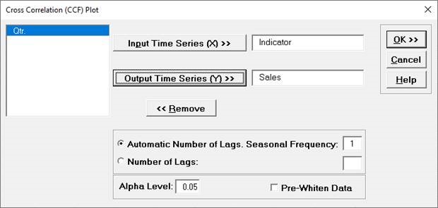
- Click OK. The CCF plot is produced.
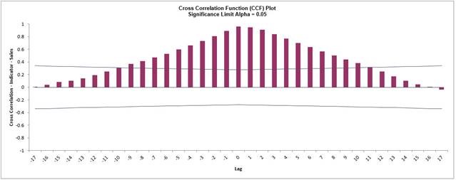
This CCF plot shows significant cross correlation from lag = -9 to +9, with a peak at 0,
however the autocorrelation in X and Y data is masking the true nature of the cross
correlation.
- We will redo the CCF Plot with the Pre-Whiten Data option. Click
Recall SigmaXL Dialog menu or press F3 to recall last
dialog. Check
Pre-Whiten Data.
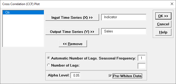
- Click OK. The CCF plot
is produced.
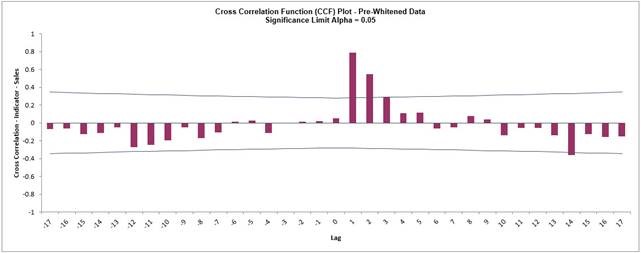
Pre-Whitening the data has dramatically altered the
CCF plot, allowing us to see the underlying cross correlation
pattern. Lags 1 and 2 are significantly positive, and Lag 3 is
just on the significance line.
Note that while X is called a leading indicator, i.e., X comes before Y in
time, the positive lag means that the X variable is lagging the Y variable in terms of
correlation structure. SigmaXL uses this convention as given in Box and Jenkins (2016,
pp. 437-440).
This CCF plot will be useful later when we model the Sales data using ARIMA
Forecast with Predictors.