Open Monthly Airline Passengers - Series G.xlsx. Click the Month Year for Interaction Plot tab. This is the Series G data from Box and Jenkins, monthly total international airline passengers for January 1949 to December 1960. Month and Year columns have been added and calculated using the Excel date functions =MONTH()
and =YEAR().
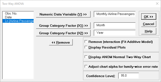
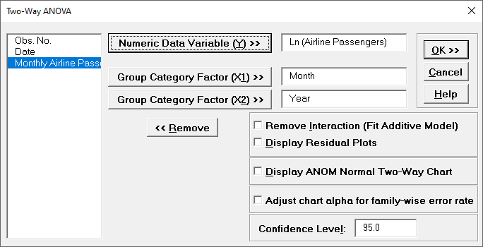
Click SigmaXL > Statistical Tools > Two-Way
ANOVA. Ensure that the entire data table is selected. If not, check Use
Entire
Data Table. Click Next.
Select Monthly Airline Passengers, click Numeric
Time Series Data (Y) >>. Select
Month for Group Category Factor (X1) >> and Year for
Group Category Factor (X2) >>. Uncheck all options:
Remove Interaction (Fit Additive Model),
Display Residual Plots, Display ANOM Normal Two-Way
Chart and
Adjust chart alpha for family-wise error rate. Use the default
Confidence Level = 95%.
Click OK. We will not use the ANOVA report.
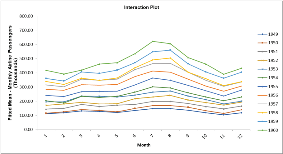
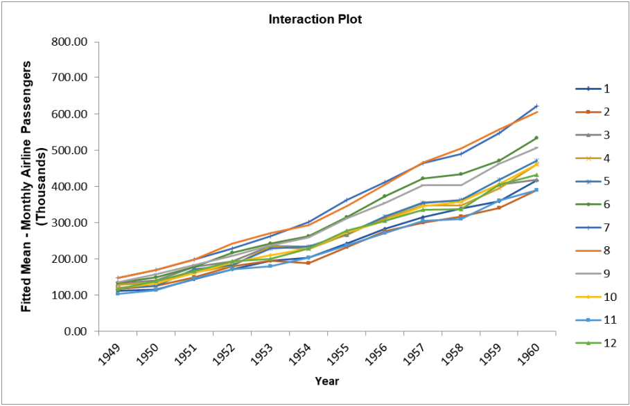
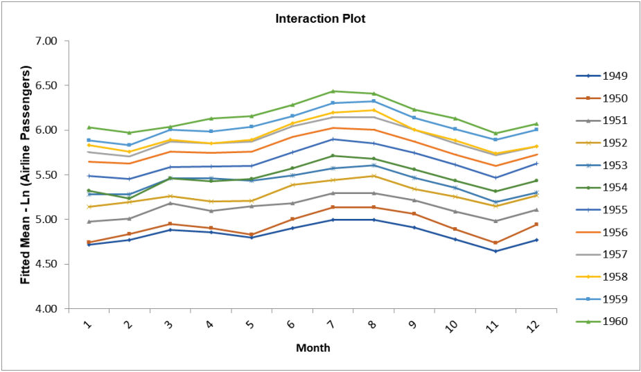
Scroll down to the Interaction Plots. Resize to view the full legend, double click on
each Y axis and set
Minimum to 0.
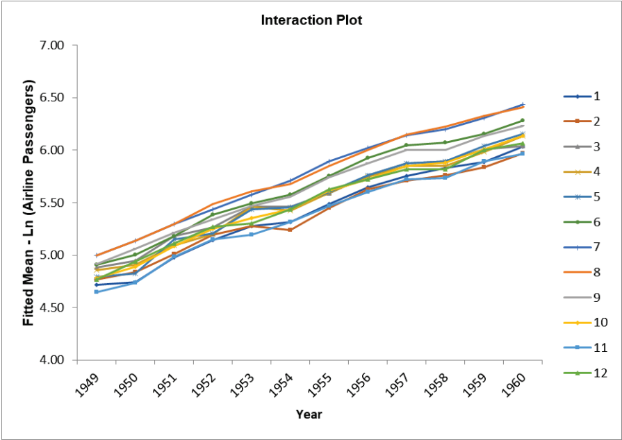
In the first interaction plot (with Month on the X axis) we can see the monthly seasonal
effect and how it gets stronger by year. The second interaction plot (with Year on the X
axis) shows the same increasing seasonal effect but we can also clearly see the strong
positive trend by year.
Now we will create Seasonal Interaction Plots for Ln (Airline
Passengers). Click
Recall SigmaXL Dialog menu or press F3 to recall last
dialog. Select
Ln (Airline Passengers) and click Numeric
Data Variable (Y) >>.
Click OK. Scroll down to the Interaction Plots.
Resize to view the full legend, double click on each Y axis and set Minimum to 4 and
Maximum to 7.
In these interaction plots with Ln (Airline Passengers), we can see that the
variability due to monthly seasonal effect is consistent and the yearly trend is
more linear. Bisgaard and Kulahch point out that using a traditional interpretation of
interaction plots, the similar slopes indicate
that the Ln transformation has effectively removed the month by year interaction, so the
month and year effect is now additive.
Bisgaard and Kulahchi (2011) give a novel use of two-way interaction plots to
view trends and seasonal effects in data. We will use Two-Way ANOVA to reproduce the
interaction charts
given in the book.
Note, in order to produce these charts, the data must be balanced, e.g., every year
must have 12 months of data.
Reference: Bisgaard, S. and Kulahchi, M. (2011), Time Series
Analysis and Forecasting by Example, Wiley, pp.111-115.