How Do I Create Run Charts in Excel Using SigmaXL?
A run chart is a fundamental quality tool used in Six Sigma and process improvement to display data points collected over time in sequence.
By plotting values against a mean or median reference line, run charts help teams detect trends, shifts, cycles, and other non-random patterns that signal process change.
SigmaXL makes it simple to create run charts directly in Microsoft Excel with automatic mean lines, and an optional nonparametric runs test for statistical validation.
Follow the step by step instructions below to build your first run chart using SigmaXL.
Click Sheet 1 Tab of Customer Data.xlsx. Click
SigmaXL > Graphical Tools > Run Chart. Ensure that entire data
table is selected. If not, check
Use Entire Data Table. Click Next.
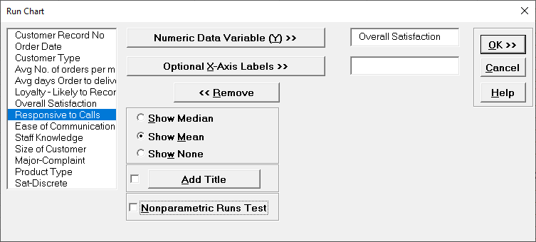
Select Overall Satisfaction, click Numeric Data Variable (Y)
>>. Select
Show Mean. Uncheck Nonparametric Runs Test (to be
discussed later in Part N of Analyze Phase).
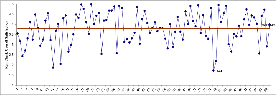
Click OK. A Run Chart of Overall Satisfaction with
Mean center line is produced.
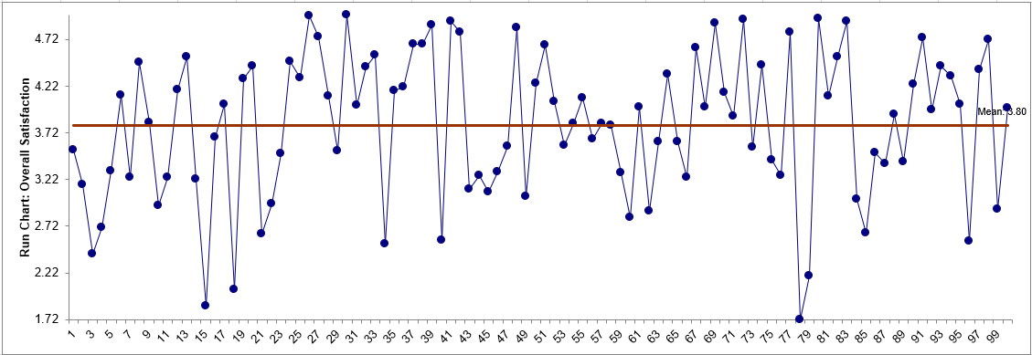
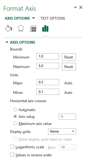
Select the Y axis, Right Click, Format Axis, to
activate the Format Axis dialog. Change Minimum to 1,
Maximum to 5, Horizontal axis crosses > Axis value
to 1:
Click OK.
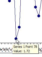
Are there any obvious trends? Some possible cycling, but nothing
clearly stands out. It may be interesting to look more closely at a specific data point.
Any data point value can be identified by simply moving the cursor over it:
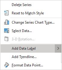
A label can be added to a data point by
one single-click on the data point, followed by a Right mouse
click, and select Add Data Label. See also
SigmaXL Chart Tools > Add Data Label in Control
Phase Tools, Part B - X-Bar & Range Charts.
Click OK. Resulting Run Chart with label attached
to data point:
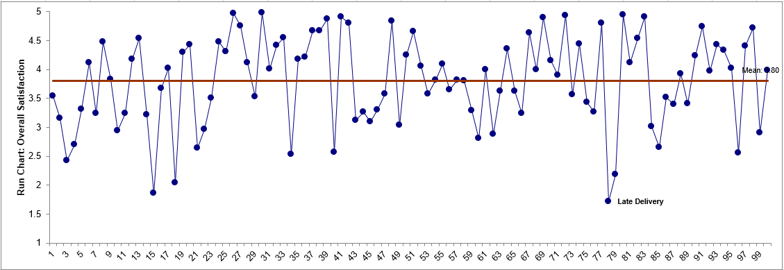
This label can be changed to a text comment. Single-click three
times on the label and type in a comment as shown: