How Do I Create Multi-Vari Charts in Excel Using SigmaXL?
The Multi-Vari chart is a powerful tool to identify dominant Sources of Variation (SOV). The
three major families of variation are: Within Unit, Between Unit, and Temporal (Over
Time). We will look at examples of each type of SOV and then use the Multi-Vari Chart to
study Overall Satisfaction in the Customer Data.xlsx file.
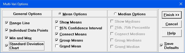
The charts shown will be updated as options are selected. Note that
they are for demonstration purposes and are not based on the
Multi-Vari Data.xlsx data. Ensure that all general
Options are selected (Range Line, Individual Data Points, Min
and Max, Standard Deviation Chart). Select
Mean Options, ensure that Show Means, Connect
Means, and
Group Means are checked. Ensure that Save Defaults is
checked. These settings would be typical for a Multi-Vari chart. (The Median options
provide the ability to display percentiles as an alternative to the Means).
Tip: Multi-Vari Charts can be used to display Confidence Intervals.
To do this, check the 95% Confidence Interval.
Click Finish. SigmaXL automatically starts the
Multi-Vari Chart procedure (this is equivalent to clicking
SigmaXL > Graphical Tools > Multi-Vari Charts).
Check Use Entire Data Table. Click
Next.
Note that the input Xs can be text or numeric but should be
discrete. Ys must be numeric - typically continuous, but can also be count or
proportion data.
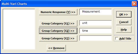
Select Measurement, click Numeric Response (Y)
>>; select unit, click
Group Category (X1) >>; select time, click Group
Category (X2) >>.
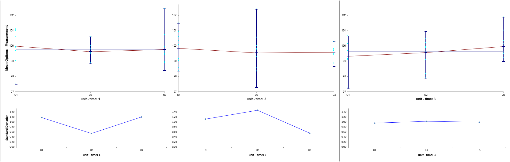
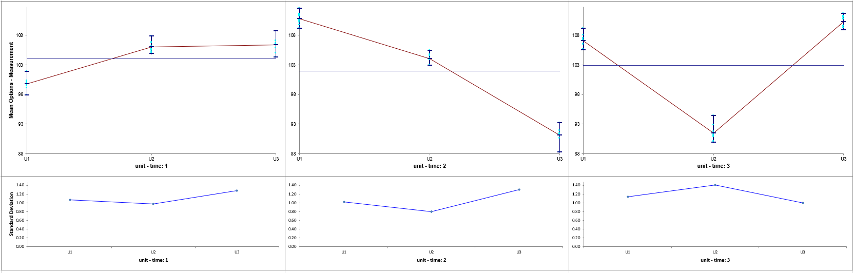
Click OK. Resulting Multi-Vari Chart illustrating
dominant Within Unit Source of Variation:
Using Multi-Vari Data.xlsx, click Sheet
Between. Select SigmaXL > Graphical Tools > Multi-Vari
Charts. Check
Use Entire Data Table. Click Next.
Select
Measurement, click Numeric Response (Y) >>; select
unit, click Group Category (X1) >>; select
time, click Group Category (X2) >>.
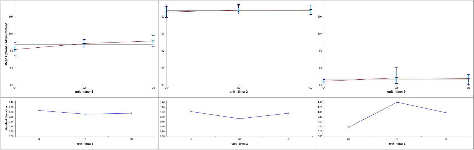
Click
OK. Resulting Multi-Vari Chart illustrating dominant Between Unit
Source of Variation:
Using
Multi-Vari Data.xlsx, click Sheet OverTime. Select
SigmaXL > Graphical Tools > Multi-Vari Charts. Check
Use Entire Data Table. Click Next.
Select
Measurement, click Numeric Response (Y) >>; select unit,
click
Group Category (X1) >>; select time, click
Group Category (X2) >>.
Click
OK. Resulting Multi-Vari Chart illustrating dominant Over Time Source
of Variation:
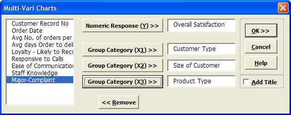
Select
Overall Satisfaction, click Numeric Response (Y) >>;
select
Customer Type, click
Group Category (X1) >>; select
Size of Customer, click
Group Category (X2) >>; select
Product Type, click
Group Category (X3) >>.
Click
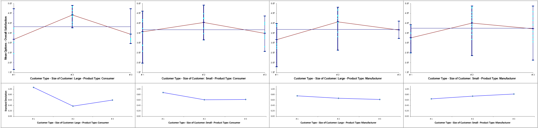
OK. Resulting Multi-Vari chart:
Examining this Multi-Vari chart reveals that the dominant Source of Variation is within Customer Type, followed by between Customer
Type. Furthermore, it would be worthwhile to examine the combination of Customer Type 2,
Customer Size Large, and Product Type Consumer.
Other tools that can help us identify potential X factors that may explain some of
the large Within variability are the Scatter Plot, Scatter Plot Matrix and Correlation
Matrix.