How Do I Create a Correlation Matrix in Excel Using SigmaXL?
The correlation matrix complements the scatterplot matrix by quantifying the degree of association. The following table shows the approximate relationship between r, R-squared, and degree of association:
- Pearson Correlation Coefficient (r)
- 0.9 <= |r| <=1
- 0.7 <= |r| <=0.9
- |r| < 0.7
- Pearson Probability, p > 0.05
- R-Squared (%)
- > 80%
- 50% to 80%
- < 50%
- Degree of association
- Strong
- Moderate
- Weak
- None
- Open Customer Data.xlsx. Click SigmaXL > Statistical Tools > Correlation Matrix. Ensure that entire data table is selected. If not, check Use Entire Data Table. Click Next.
- Select the variable Avg No. of orders per month;
shift-click on
Staff Knowledge and click Numeric Data Variables (Y) >>
as shown:
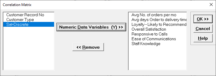
- Click OK. Resulting Correlation Matrix is shown:
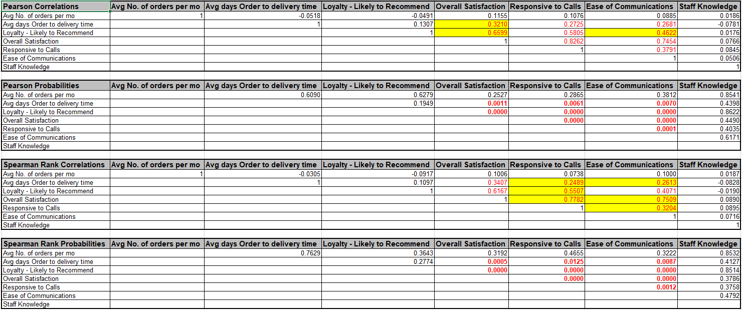
Correlations highlighted in red are considered significant (p-values < .05). The corresponding correlation coefficients above the p-values are also highlighted in red. (Compare these to the Scatterplot Matrix.)
Note that Spearman's Rank Correlation complements Pearsons Correlation, in that it provides a robust measure of association. Spearman's rank is based on correlated ranks, which are not sensitive to outliers or departures from normality.
An automatic normality check is applied, utilizing the powerful Doornik-Hansen bivariate normality test. A yellow highlight recommends Pearson or Spearman correlations be used (but only if it is significant). Pearson is highlighted if the data are bivariate normal, otherwise Spearman is highlighted. Always review the data graphically with the Scatterplot Matrix as well.