How Do I Create Individuals Charts for Nonnormal Data in Excel Using SigmaXL?
Individuals Charts for Nonnormal Data (Box-Cox Transformation)
An important assumption for Individuals Charts is that the data be normally distributed (unlike the X-Bar Chart which is robust to nonnormality due to the central limit theorem). If the data is nonnormal, the Box-Cox Transformation tool can be used to convert nonnormal data to normal by applying a power transformation. The Johnson transformation and other distributions may also be used with Automatic Best Fit (see Measure Phase Tools, Part J Process Capability, Capability Combination Report Individuals Nonnormal).
Open the fileNonnormal Cycle Time2.xlsx.
This contains continuous nonnormal data of process cycle times. We performed a Process Capability study with this data earlier in the Measure Phase, Part H.
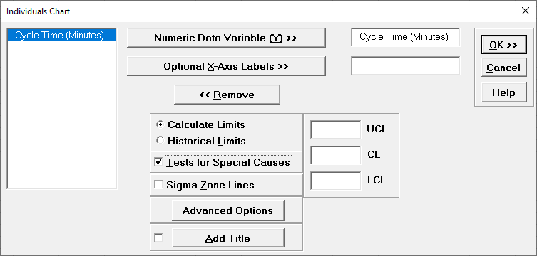
Initially, we will ignore the nonnormality in the data and construct an Individuals Chart. ClickSigmaXL > Control Charts > Individuals.
Ensure that entire data table is selected. If not, checkUse Entire Data Table.
ClickNext.
Select Cycle Time (Minutes), click
Numeric Data Variable (Y) >>.
SelectCalculate Limits.
CheckTests for Special Causes. Click OK.
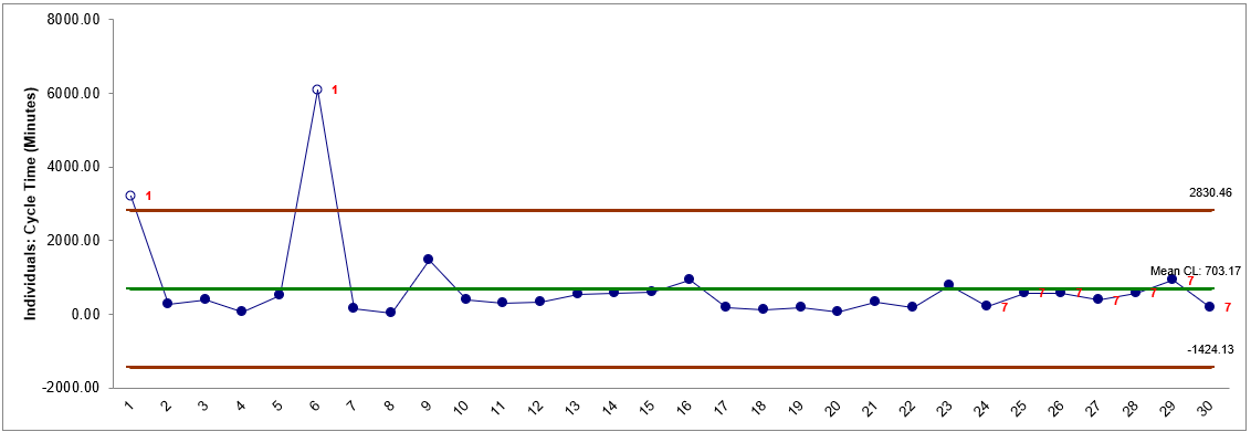
The resulting Individuals Chart is shown:
This chart clearly shows that the process is out-of-control. But is it really? Nonnormality can cause serious errors in the calculation of Individuals Chart control limits, triggering false alarms (Type I errors) or misses (Type II errors).
We will now construct Individuals Control Charts for nonnormal data. SelectSheet 1Tab (or pressF4).
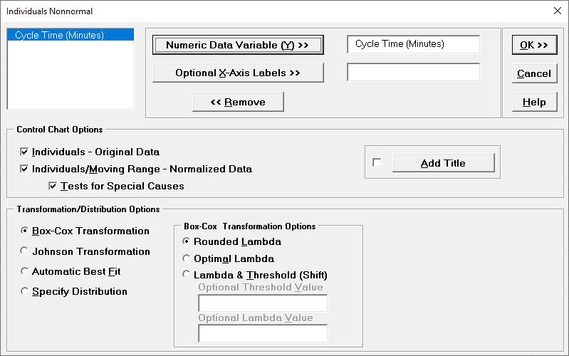
ClickSigmaXL> Control Charts > Nonnormal > Individuals Nonnormal.
Ensure that the entire data table is selected. If not, checkUse Entire Data Table.
ClickNext.
Select Cycle Time (Minutes), clickNumeric Data Variable (Y) >>.
We will use the default selection forTransformation/Distribution Options: Box-Cox TransformationwithRounded Lambda.
CheckTests for Special Causesas shown:
Click
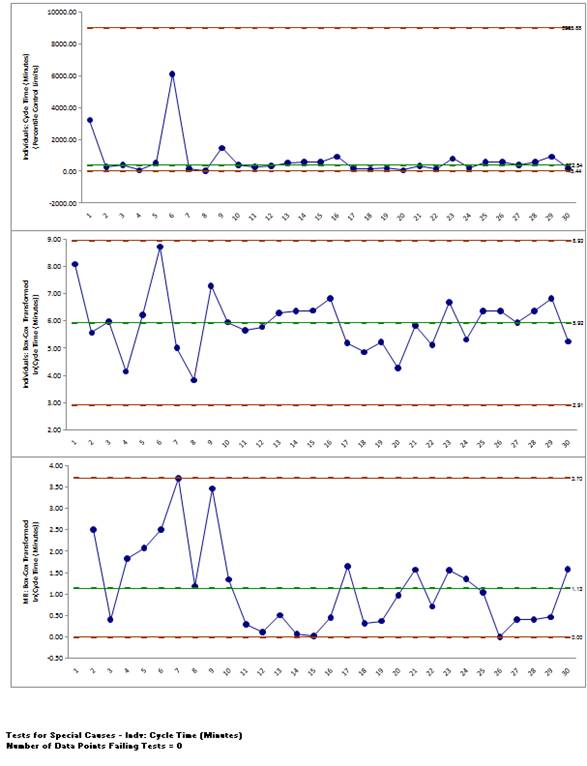
OK. The resulting control charts are shown below:
Note that there are no out-of-control signals on the control charts, so the signals observed earlier when normality was assumed were false alarms.
The Individuals Original Data chart displays the untransformed data with control limits calculated as:
The benefit of displaying this chart is that one can observe the original untransformed data. Since the control limits are based on percentiles, this represents the overall, long term variation rather than the typical short term variation. The limits will likely be nonsymmetrical.
The Individuals/Moving Range Normalized Data chart displays the transformed z-values with control limits calculated using the standard Shewhart formulas for Individuals and Moving Range charts. The benefit of using this chart is that tests for special causes can be applied and the control limits are based on short term variation. The disadvantage is that one is observing transformed data on the chart rather than the original data.