Just as correlation measures the extent of a linear relationship between two variables,
autocorrelation measures the linear relationship between lagged values of data. A plot of
the data vs. the same data at lag 𝑘 may show a positive or negative trend. If the slope is
positive, the autocorrelation is positive; if there is a negative slope, the autocorrelation
is negative. We will use the lag utility and scatterplots to demonstrate this for 3 lags
using the Series A data.
ACF denotes the AutoCorrelation Function plot (sometimes called a Correlogram). PACF denotes
the Partial AutoCorrelation Function plot.
We will use the ACF and PACF to get a general idea of what models should be used, but let the
automatic algorithms do the heavy lifting of determining which model is optimal. Later, ACF
on model residuals are used to assist in determining how well a model fits the
autocorrelation structure, ideally with the residuals showing no statistically significant
autocorrelation.
We will also examine how differencing results in stationarity with the ACF and PACF plots.
Chemical Process Concentration - Series A
Open Chemical Process Concentration Series
A.xlsx (Sheet 1 tab).
This is the Series A data from Box and Jenkins, a set of 197 concentration values from a
chemical process taken at two hour intervals.
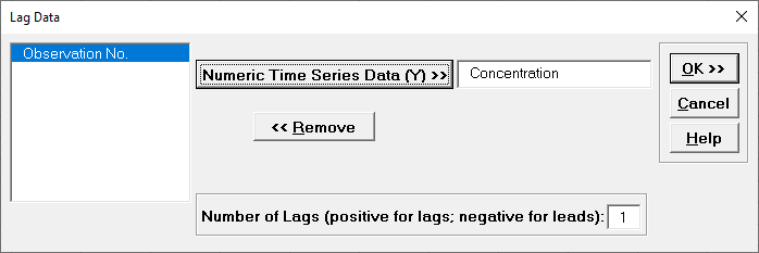
Click SigmaXL > Time Series Forecasting > Utilities
> Lag Data.
Ensure that the entire data table is selected.
If not, check Use Entire Data Table.
Click Next.
Select Concentration, click Numeric Time Series
Data (Y) >>.
Use the default Number of Lags = 1.
Click OK. A new sheet is created with the Lag 1
data.
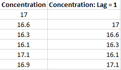
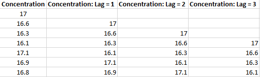
Click Recall SigmaXL Dialog
menu or press F3 to Recall Last Dialog. Enter Lag = 2.
Click OK. Repeat for Lag = 3.
The Lag columns are appended as shown:
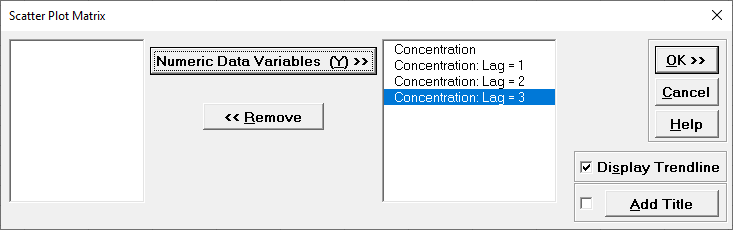
Click SigmaXL > Graphical Tools > Scatter Plot
Matrix. Ensure that the entire data table is selected.
If not, check Use Entire Data Table.
Click Next.
Select all four columns, click Numeric Data Variables (Y) >>.
Check Display Trendline.
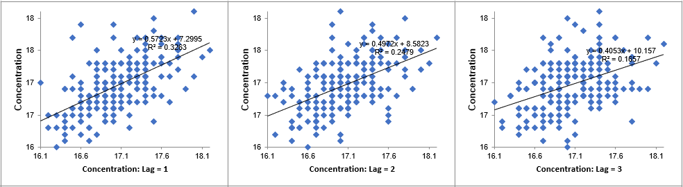
Click OK. The Scatterplots for Lag 1 to 3 are
produced, showing a positive trend, so positive autocorrelation.
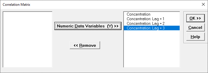
Click the Lag Data sheet tab. Click
SigmaXL > Statistical Tools > Correlation Matrix.
Ensure that the entire data table is selected. If not, check Use Entire Data Table.
Click Next.
Select all four columns, click Numeric Data Variables (Y)
>>.
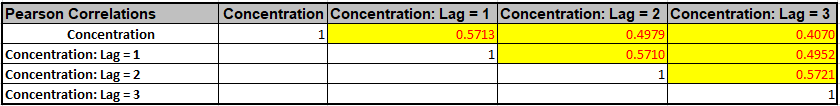
Click OK. The Correlation Coefficient Matrix is
produced.
Lag 1 correlation is .57, Lag 2 is .5, and Lag 3 is .41. The correlations in red (and bolded
P-Values) indicates that the correlations are significant.
Now we will create the ACF/PACF plots.
Click the Sheet 1 tab.
Click SigmaXL > Time Series Forecasting > Autocorrelation (ACF/PACF)
Plots.
Ensure that the entire data table is selected.
If not, check Use Entire Data Table.
Click Next.
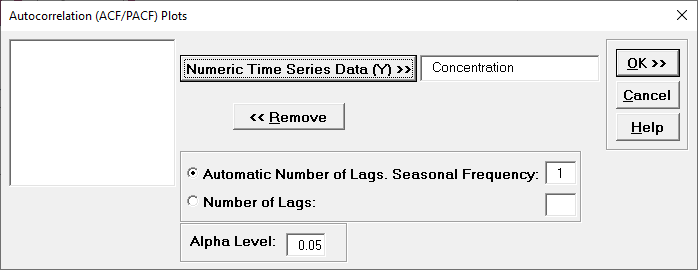
Select Concentration, click Numeric Time Series
Data (Y) >>.
Use the default Automatic Number of Lags. Seasonal
Frequency = 1. Alpha Level = 0.05.
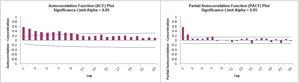
Click OK. The ACF and PACF plots are produced.
Hover the mouse cursor on the Lag 1 ACF bar to view the correlation value = .57, Lag 2 =
0.5, and Lag 3 = .4.
The values are approximately the same as those obtained manually (with some minor
differences in how the correlations are calculated).
The lags that exceed the significance limit lines are statistically significant at alpha =
0.05, so there is an autocorrelation structure in the data which can be modeled using
Exponential Smoothing or ARIMA.
The slow decrease in the ACF as the lags increase is due to the
non-stationarity, so we will now compare to the differenced data.
Select the Difference Data sheet (or recreate using SigmaXL
> Time Series Forecasting > Utilities > Difference Data, with
Nonseasonal Differencing (d) = 1).
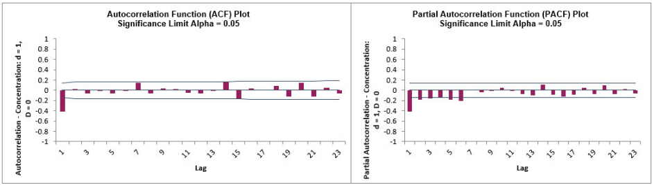
Redo the ACF/PACF Plots for the differenced data:
After differencing Lag 1 now shows a negative autocorrelation, but Lag 2 and following have
insignificant autocorrelations and small partial autocorrelations.
This is in agreement with the results in Box and Jenkins (2016, pp.185-186) who also suggest
that, after differencing, the model might be a moving average of order 1.
We will examine this later in ARIMA Forecasting.
Monthly Airline Passengers - Series G
Open Monthly Airline Passengers - Series G.xlsx
(Sheet 1 tab).
This is the Series G data from Box and Jenkins, monthly total international airline
passengers for January 1949 to December 1960.
Click SigmaXL > Time Series Forecasting >
Autocorrelation (ACF/PACF) Plots.
Ensure that the entire data table is selected.
If not, check Use Entire Data Table.
Click Next.
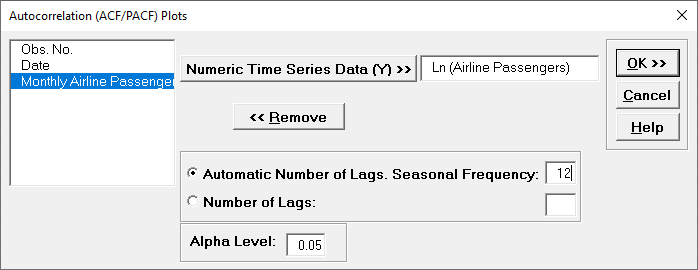
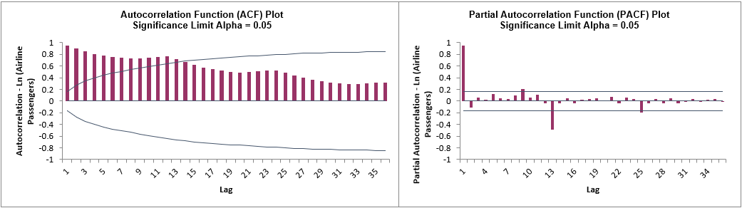
Select Ln(Airline Passengers), click Numeric Time
Series Data (Y) >>.
Select Automatic Number of Lags.
Specify Seasonal Frequency = 12 and Alpha Level =
0.05.
The automatic number of lags will be (a minimum of) Seasonal Frequency * 3 = 36 allowing us
to see seasonal patterns in the ACF.
Click OK. The ACF and PACF plots are produced.
The slow decrease in the ACF as the lags increase is due to the trend, while the scalloped
shape is due to the seasonality.
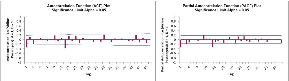
We will now compare to the differenced data for Ln(Airline
Passengers).
Select the Difference Data sheet (or recreate using SigmaXL
> Time Series Forecasting > Utilities > Difference Data, with
Nonseasonal Differencing (d) = 1 and Seasonal Differencing
(D) = 1 with Seasonal Frequency = 12).
Redo the ACF/PACF Plots for the differenced data:
After nonseasonal and seasonal differencing, Lag 1 now shows a negative autocorrelation, but
Lag 2 and following have mostly insignificant autocorrelations and partial autocorrelations.
Lag 12 is due to the seasonality.
This is in agreement with the results in Box and Jenkins (2016, Chapter 9, Analysis of
Seasonal Time Series, p. 319) who also suggest that, after differencing, the model might be
a moving average of order 1 and seasonal moving average of order 1.
We will examine this later in ARIMA Forecasting.
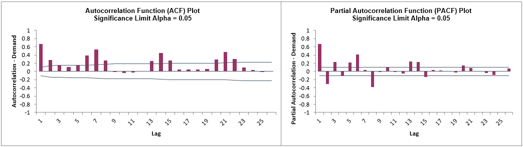
Daily Electricity Demand with Predictors ElecDaily
Open Daily Electricity Demand with Predictors
ElecDaily.xlsx (Sheet 1 tab).
This is daily electricity demand (GW) for the state of Victoria, Australia, every day
during 2014 (Hyndman, fpp2).
This data has a seasonal frequency = 7 (observations per week).
Click SigmaXL > Time Series Forecasting >
Autocorrelation (ACF/PACF) Plots.
Ensure that the entire data table is selected.
If not, check Use Entire Data Table.
Click Next.
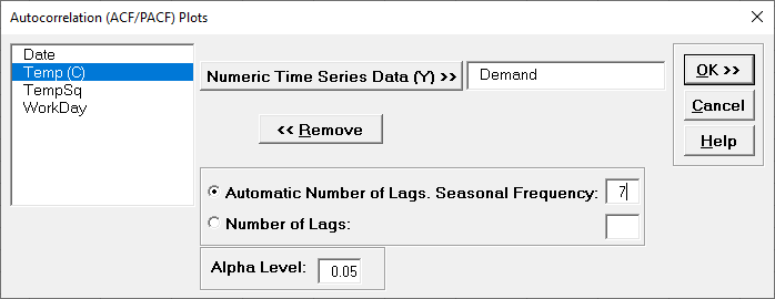
Select Demand, click Numeric Time Series Data (Y)
>>.
Select Automatic Number of Lags.
Specify Seasonal Frequency = 7 and Alpha Level = 0.05.
Click OK.
The ACF and PACF plots are produced.
Here we can see the 7-day seasonal pattern. We will not do manual differencing for this
example, but the automatic ARIMA algorithm will do a nonseasonal difference (d) = 1 and
leave the seasonal differencing (D) = 0.
Sales with Indicator - Modified Series M
Open Sales with Indicator - Modified Series
M.xlsx. (Sheet 1 tab).
This is modified Series M data from Box and Jenkins, with 50 quarters of corporate sales
values along with a leading indicator.
The data is treated as nonseasonal, as done in Box and Jenkins.
Click SigmaXL > Time Series Forecasting >
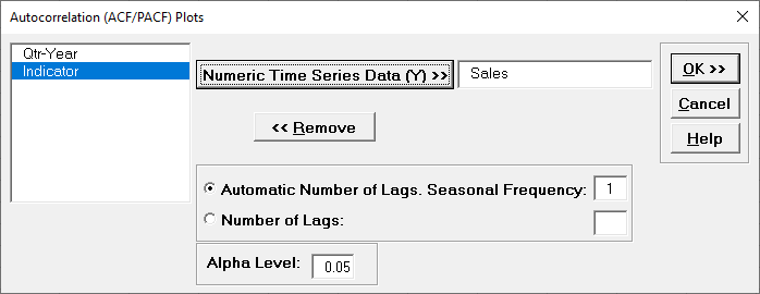
Autocorrelation (ACF/PACF) Plots.
Ensure that the entire data table is selected.
If not, check Use Entire Data Table.
Click Next.
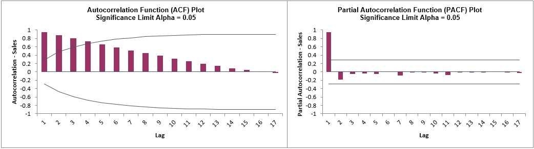
Select Sales, click Numeric Time Series Data (Y)
>>.
Select Automatic Number of Lags.
Specify Seasonal Frequency = 1 and Alpha Level = 0.05.
Click OK.
The ACF and PACF plots are produced.
Here we can see the strong autocorrelation with slow decay due to the trend.
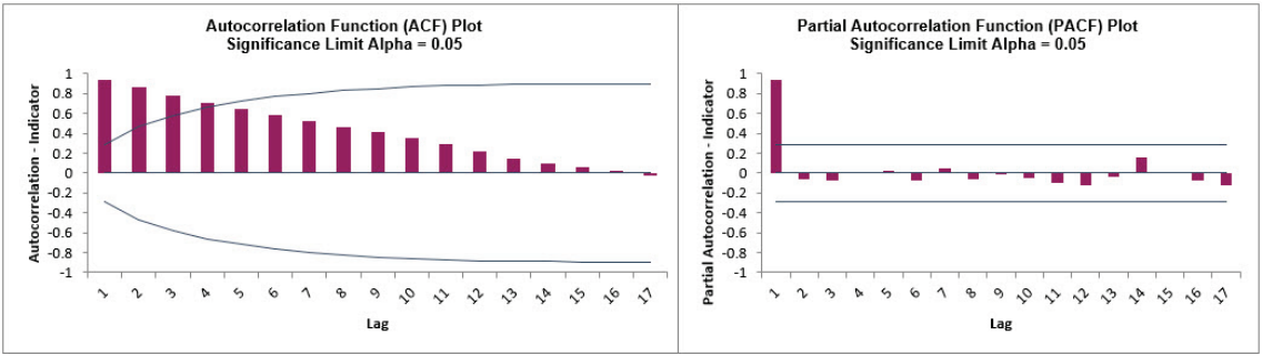
Click the Sheet 1 tab.
Redo the ACF/PACF Plots for Indicator:
As expected, the autocorrelation for Indicator is very similar to Sales. This will be
addressed when Cross Correlation (CCF) Plots are created.
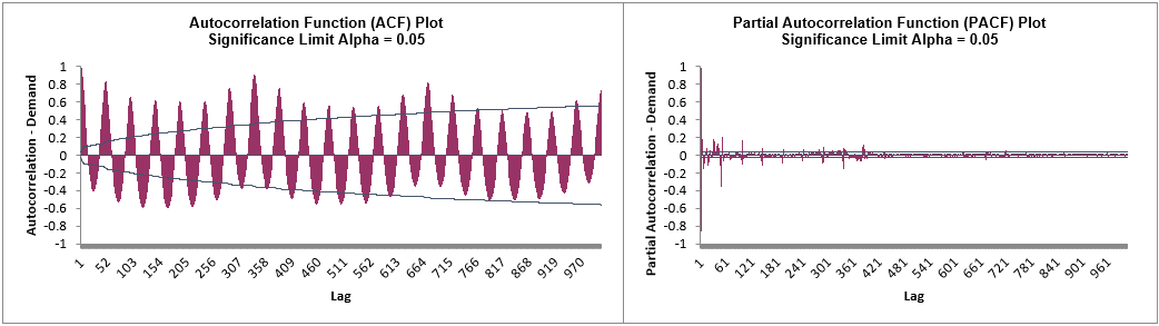
Half-Hourly Multiple Seasonal Electricity Demand Taylor
Open Half-Hourly Multiple Seasonal Electricity Demand - Taylor.xlsx (Sheet 1 tab).
This is halfhourly electricity demand (MW) in England and Wales from Monday, June 5, 2000 to Sunday, August 27, 2000 (taylor, R forecast).
This data has multiple seasonality with frequency = 48 (observations per day) and 336 (observations per week), with a total of 4032 observations.
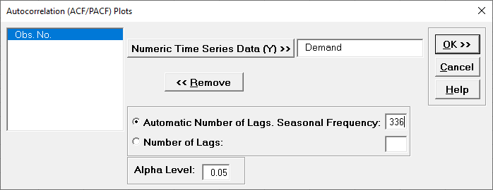
Click SigmaXL > Time Series Forecasting > Autocorrelation (ACF/PACF) Plots.
Ensure that the entire data table is selected.
If not, check Use Entire Data Table.
Click Next.
Select Demand, click Numeric Time Series Data (Y) >>.
Select Automatic Number of Lags.
Specify Seasonal Frequency = 336 and Alpha Level = 0.05.
The automatic number of lags will be (a minimum of) Seasonal Frequency * 3 = 1008 allowing us to see seasonal patterns in the ACF.
Click OK.
The ACF and PACF plots are produced.
Here we can see the half-hourly seasonal patterns of 48 per day and 336 per week.