How Do I Perform Chi-Square Tests in Excel Using SigmaXL?
Chi-Square Test & Association
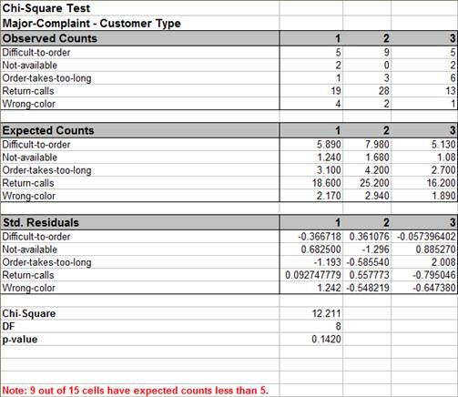
Open Customer Data.xlsx. Click Sheet 1 tab. The discrete data of interest is Complaints and Customer Type, i.e., does the type of complaint differ across customer type? Formally the Null Hypothesis is that there is no relationship (or independence) between Customer Type and Complaints.
Click SigmaXL > Statistical Tools > Chi-Square Test & Association.
Ensure that the entire data table is selected. If not, check Use Entire Data Table. Click Next.
With the p-value = 0.142 we fail to reject H0, so we do not have enough evidence to show a difference in customer complaints across customer types.
Note: 9 out of 15 cells have expected counts less than 5. If more than 20% of the cells have expected counts less than 5 (or if any of the cells have an expected count less than 1), the Chi-Square approximation may be invalid. Use Chi-Square Test – Fisher’s Exact).
Tip: Use Advanced Pareto Analysis and Excel’s 100% Stacked Column Chart to complement Chi-Square Analysis.
Caution: When using stacked column format data with Ordinal Category variables that are text, SigmaXL will sort alphanumerically which may not result in the correct ascending order for analysis. We recommend coding text Ordinal variables as numeric (e.g., 1,2,3) or modified text (e.g., Sat_0, Sat_1).
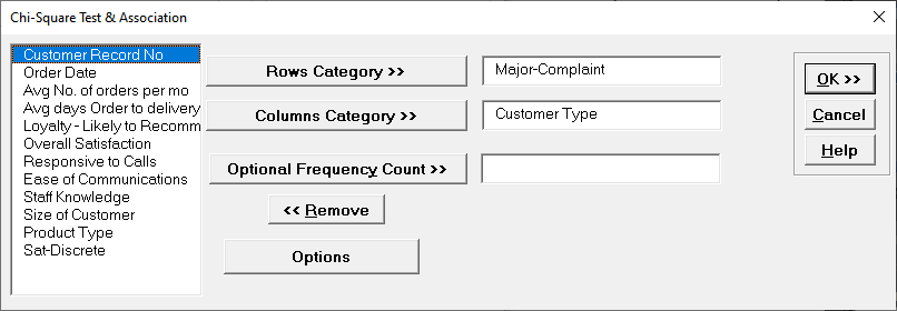
Press F3 or click Recall SigmaXL Dialog to recall last dialog. Select
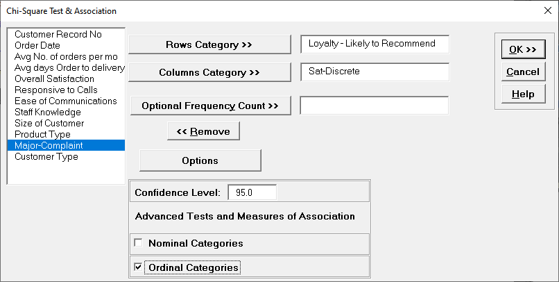
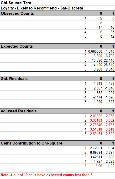
Loyalty – Likely to Recommend, click Rows Category >>; select Sat-Discrete, click Columns Category >>. Click Options, check Ordinal Categories.
Sat-Discrete is derived from Overall Satisfaction where a score >= 3.5 is considered a 1, and scores < 3.5 are considered a 0.
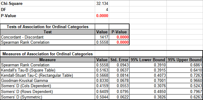
Click OK. Results:
As expected, there is a strong positive association between Loyalty and Discrete Satisfaction.
Note: Kendall-Stuart Tau-C should be used here rather than Tau-B because it is a rectangular table.
Since Satisfaction leads to Loyalty, Loyalty is the Dependent variable, so Rows Dependent Somers’ D should be used rather than Cols Dependent or Symmetric.
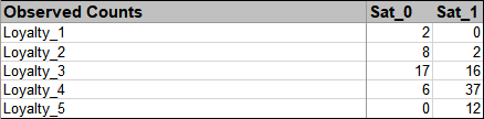
In order to visualize the row and column percentages with Excel’s 100% Stacked Column Chart, we will need to modify the numeric row and column labels as shown, converting to text as shown:
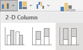
Select cells A3:C8 of the Chi-Square sheet. Click Excel’s Insert > Insert Column or Bar Chart and select 100% Stacked Column as shown.
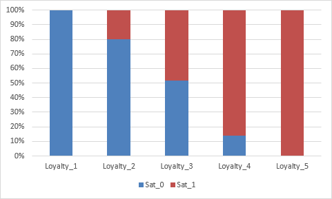
Click to create the 100% stacked column chart (uncheck the Chart Title):
Chi-Square Test (Two-Way Table Data)
>
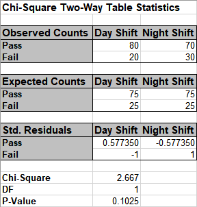
Open the file Attribute Data.xlsx, ensure that Example 1 Sheet is active. This data is in Two –Way Table format, or pivot table format. Note that cells B2:D4 have been pre-selected.
Click SigmaXL > Statistical Tools > Chi-Square Test & Association – Two-Way Table Data. Note the selection of data includes the Row and Column labels (if we had Row and Column Totals these would NOT be selected). Do not check Advanced Tests and Measures of Association.
The p-value matches that of the 2 proportion test. Since the p-value of 0.1 is greater than .05, we fail to reject H0.
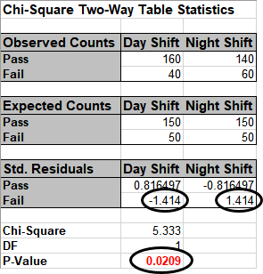
Now click Example 2 Sheet tab. The Yields have not changed but we have doubled the sample size. Repeat the above analysis. The resulting output is:
Since the p-value is < .05, we now reject the Null Hypothesis, and conclude that Day Shift and Night Shift are significantly different. The Residuals tell us that Day Shift failures are less than expected (assuming equal proportions), and Night Shift failures are more than expected.
Note, by doubling the sample size, we improved the power or sensitivity of the test.
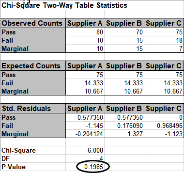
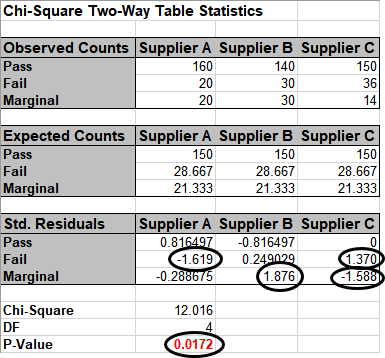
Click the Example 3 Sheet tab. In this scenario we have 3 suppliers, and an additional marginal level. A random sample of 100 units per supplier is tested. The null hypothesis here is: No relationship between Suppliers and Pass/Fail/Marginal rates, but in this case we can state it as No difference across suppliers. Redoing the above analysis (for selection B2:E5) yields the following:
The p-value tells us that we do not have enough evidence to show that there is a difference across the 3 suppliers.
Click the Example 4 Sheet tab. Here we have doubled the sample size to 200 per supplier. Note that the percentages are identical to example 3. Redoing the above analysis yields the following:
With the P-Value < .05 we now conclude that there is a significant difference across suppliers. Examining the Std. (Standardized) Residuals tells us that Supplier A has fewer failures than expected (if there was no difference across suppliers), Supplier B has more marginal parts than expected and Supplier C has fewer marginal parts than expected.
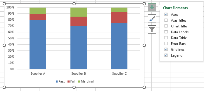
The table row and column cell percentages can be visualized using Excel’s 100% Stacked Column Chart.
Select cells A3:D6 of the Chi-Square sheet.
Click Excel’s Insert > Insert Column or Bar Chart and select 100% Stacked Column as shown.
Click to create the 100% stacked column chart. Uncheck the Chart Title as shown.
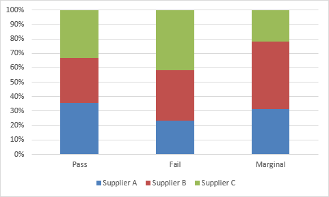
The rows and columns can easily be switched by clicking Design > Switch Row/Column.
These charts make it easy to visualize the cell row and column percentages.
Define, Measure, Analyze, Improve, Control
Simulate, Optimize, Realize
Web Demos
Our CTO and Co-Founder, John Noguera, regularly hosts free Web Demos featuring SigmaXL and DiscoverSim Click here to view some now!